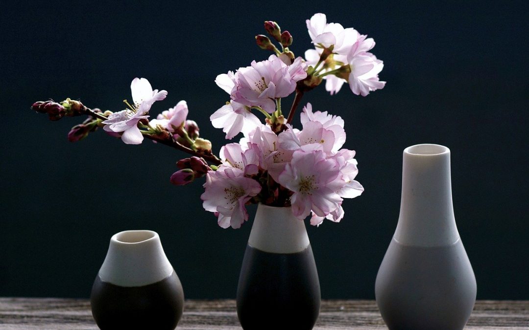
The word “vignette” can be used in a variety of ways, but when it comes to styling, it’s used to describe a small grouping of objects. The aim is to create an attractive focal point, which potentially tells a small story. The best part is they can be a quick, cheap way to lift your room from being stark and clinical into something stylish and unique.
Vignettes are only limited by your imagination. You don’t even have to buy items specially – go on a treasure hunt around your home and collect all your interesting bits and pieces like vases, plants, photos, personal belongings, souvenirs, books and more. Think of yourself as being in the movies, dressing a set.
The next step is put your items together as one or more vignettes. They may seem random, but here are 6 simple tips for styling with vignettes that add style, not clutter.
1. Where?
First up, where do you want to create your vignette? Any flat surface can work, so consider your coffee table, entry table, mantelpiece and more. Clear off what’s already there, so you get a feel for the space available. If anything you’ve removed needs to stsay (eg alarm clock) then keep it handy – with some thought you can add it into your vignette! If there’s wall space directly behind the surface, remember that if it isn’t permanently fixed to the wall, it can be moved. If the space is a little dark, consider keeping or adding a lamp as part of your design.
2. What to Use?
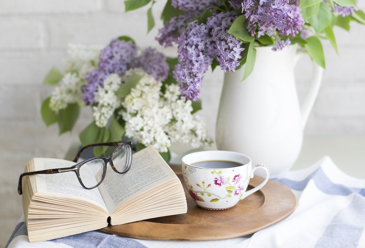
The best vignettes stick to a theme, preferably one which supports the existing style or theme of the room. The best starting point is to choose an “anchor” item. This is generally a larger item in the room that is near your vignette space, and can be used to dictate the theme. So a formal painting and room suggests a more formal vignette, whereas a casual anchor piece might dictate a more asymmetric grouping of quirky items for your vignette. Or your theme can be dictated by the type of room – a grouping of kitchen items such as a teapot, canisters or utensils works well in a kitchen, for example.
3. Think About Colours
It’s generally best to keep the color palette of your vignette simple, in order to obtain a good level of cohesion between the items. Study the room colours to decide which items are most complementary. Alternatively, you can add an unexpected pop of colour in your vignette to really make it stand out against a quieter background. This can be a good strategy if you want to draw the eye away from other shortcomings in the room.
4. Vary the Textures
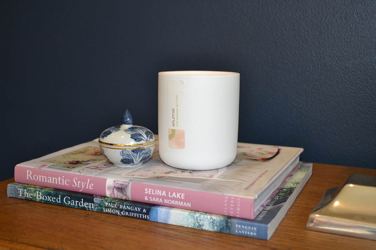
Vignettes work well with a mix of different textures, particularly if they’re all similar colours. Mix natural or rough textures with shiny or hard ones. Soft lines such as the petals of flowers can work well mixed with rougher textures such as weathered wood or rusty iron.
5. Odd is Good!
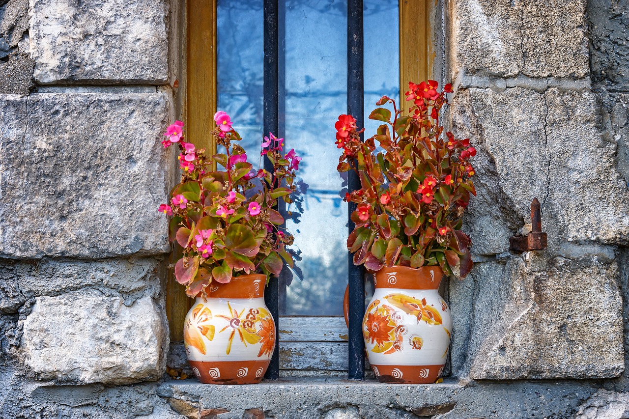
It sounds crazy, but almost overwhelmingly stylists agree that you should group your objects together in odd numbers for the best result. Groups of three or five are most common, using objects of similar shape, size or theme. Sometimes you might think you only have 2 items, but the correct placement relative to fixed items can make it three. For example, the window sill pictured below has 2 pots and 2 plants, but the window in-between creates one extra item, creating a group of 5.
6. Vary the Heights
It’s important to add some changes in height to your vignette, to encourage the eye to travel around all the objects. If your items are similar, then consider placing one or two on a small pedestal, or a stack of books (an odd number!) to achieve the variation in height. When placing your items, start with the biggest item at the back, and work forwards placing items in order of size, with the smallest items at the front.
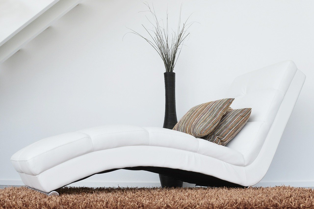
When you’re done, it’s always good to step back and look at your vignette from a range of viewing points within the room, to make sure it works. Feel free to tweak the items as much as you need to. This can be almost as much fun as creating the vignette in the first place. Even better, vignettes aren’t permanent, so if you get bored with the one you created, go ahead and change it either a little or completely. It’s your choice! Now go and have fun unleashing your inner vignette creator!

