Recently we looked at using complementary colours when putting together the look of your home. This time we’re taking a look at analogous colour schemes.
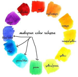
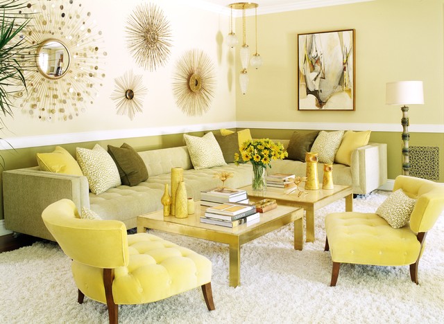
Analogous (even harder to say than it is to type!) colours sit next to each other on the colour wheel. As an example, red-orange-yellow. McDonald’s, anyone? The idea is to create an interior where the colours to some extent blend, but still have enough variation to provide interest.

Source: https://www.figma.com/dictionary/analogous-colors/
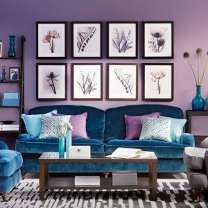
For interior design, 3 colours is the standard combination for an analogous colour scheme. There are different ways to implement this, depending on how many segments your colour wheel has, but 2 primary colours and the intervening secondary colour is common. Along with the previous example, red-purple-blue is another popular choice.

Source: https://www.digsdigs.com/analogous-decor-ideas/
Having said that, on a bigger colour wheel, the variation in colour can be a lot more subtle, such as using a primary colour and progressively blending it with more of the next primary colour around the wheel.
The key to success with an analogous colour scheme is proportion. One colour will dominate, with the others acting in supporting roles. The Rule of 60-30-10 is frequently used to determine how much of each colour to use, although it’s your choice which colour you use for each of those proportions.
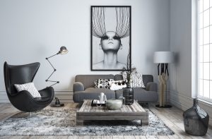
Another interesting variant is to do something similar with neutrals, which is often called a monochromatic colour scheme. Black, white and grey become your analogous “colours”. This can be used very effectively with one single item of a bright colour, such as red, as the eye is instantly drawn to the pop of colour.
Now you know the “rules” of an analogous colour scheme, having fun playing with them and potentially even breaking them!

Visualizer: Ksenia Tkachenko

