by Property Reimagined | Oct 26, 2024 | Colour That Pops, Styling Tips
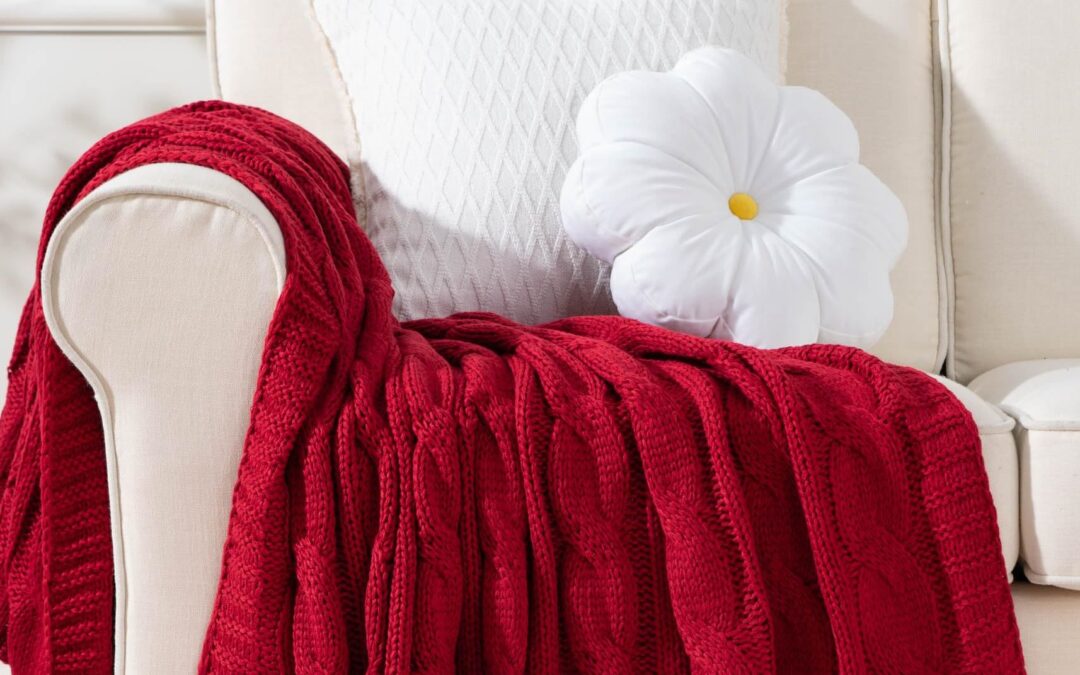
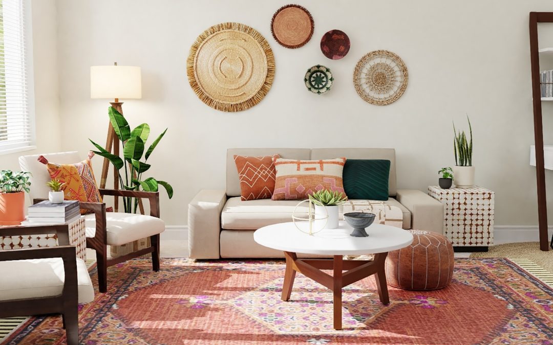
Adding colour through a single, thoughtfully chosen textile can make a significant impact on a room’s aesthetic, providing style and personality without overwhelming the space. A single textile in a striking colour can also enhance the room’s character and...

by Property Reimagined | Jul 7, 2024 | Colour That Pops, Renovations
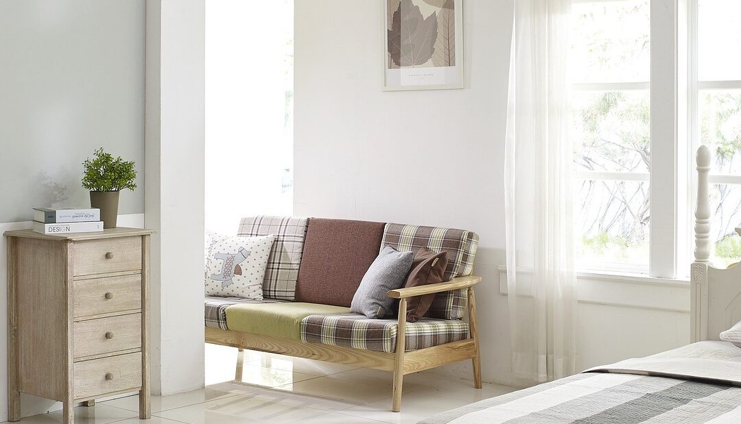
It’s a long held rule in decorating that white is a great choice when you’re trying to create the illusion of space. But that raises a rather important question – which white? There have been plenty of jokes told where one person says white, and the...

by Property Reimagined | Mar 10, 2024 | Colour That Pops, Styling Tips
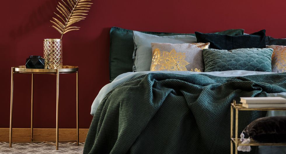
A hunter green and red colour scheme can offer several advantages, particularly in design and aesthetics. It provides a strong visual contrast, enabling individual elements to stand out as well as being visually dynamic. This combination works particularly well if you...

by Property Reimagined | Jan 7, 2024 | Colour That Pops
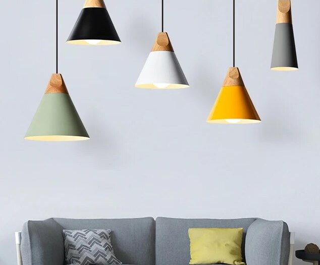
Adding a pop of colour with statement lighting is a fantastic way to infuse personality and vibrancy into a space. Here are some ideas to help you achieve this: Consider Colour Blocking Introduce a lighting fixture that complements or matches the colour of a key...

by Property Reimagined | Sep 30, 2023 | Colour That Pops
Adding a pop of colour with a rug is a great way to liven up a room and give it a fresh, vibrant look. A long runner can also add colour to unexpected places and add dimension to just about any room or hallway. Here are some tips on how to choose and incorporate a...

by Property Reimagined | Jun 10, 2023 | Colour That Pops
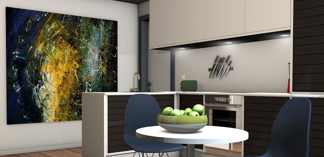
It’s a staple of interior design for main surfaces to be decorated in more neutral tones, forming a background that can be enhanced with other elements. Doing things this way makes it quick and easy to change the feel or focus of the room. Artwork is a great way...
