by Property Reimagined | Mar 18, 2023 | Colour That Pops, What's on Trend
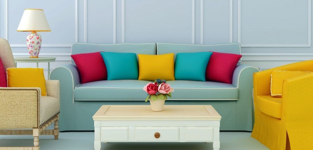
Personally, I love colour, so I haven’t been a big fan of many of the recent monochromatic trends for interior design. I’m excited that this year we’re seeing a big shift back towards strong colours. Maybe we all just need cheering up after the last...

by Property Reimagined | Dec 17, 2022 | Colour That Pops, What's on Trend
The festive season is upon us, and it’s time to start looking ahead to 2023 and what colours are predicted to be on trend. It’s actually quite interesting this year. Two of the leading lights in this space are Pantone and Coloro + WGSN. Pantone predicts...

by Property Reimagined | Sep 10, 2022 | Colour That Pops
Monochromatic colour schemes have been the darlings of the design world for a while now, but some people want something a little warmer and friendlier for their spaces. Welcome back cream and ivory! Depending on how old you are, you may remember the era when the...

by Property Reimagined | Apr 30, 2022 | Colour That Pops
I almost feel sorry for the colour brown. I mean, how often do you hear someone declare their desire to have a brown colour scheme in their home? Pretty close to never, unless they’re still stuck in the seventies. But there’s a shift in the air, and brown...

by Property Reimagined | Feb 13, 2022 | Colour That Pops, Styling Tips
I’ve discussed a number of different colour schemes you can use in your styling in the past, such as Analagous and Complementary. This time, let’s look at using a triadic colour scheme (sometimes referred to as a triad scheme). Sounds a bit scary, right?...

by Property Reimagined | Jan 15, 2022 | Colour That Pops
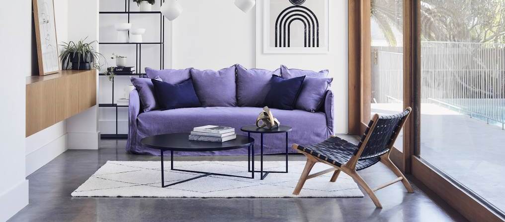
Recently, I wrote a blog post talking about the “Colour of the Year for 2022” announcements from various sources. Pantone is the big one, and they chose Very Peri. But orchid and emerald green got a look in as well. There’s no doubt a lot of people...
