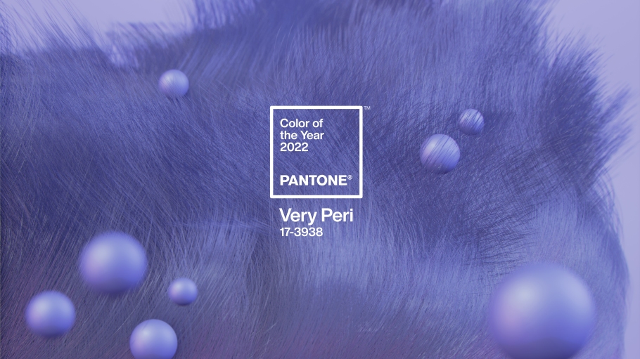
by Property Reimagined | Jan 1, 2022 | Colour That Pops, What's on Trend
As the last of the fireworks fade out of the sky and the champagne bottles are dumped in the recycling bin, it’s time to think about colour trends for the new year. There have been lots of announcements in the past month. Probably the most eagerly awaited one...

by Property Reimagined | Oct 22, 2021 | Colour That Pops
Grey has been the darling of the interior design world for a number of years now, with good reason. It’s an extremely versatile neutral, ranging from deep charcoal greys right through to the lightest of greys that border on white. Grey can also work well for a...

by Property Reimagined | Sep 18, 2021 | Colour That Pops
While black is classed as a neutral colour, it tends to sit apart from other neutral colours as it’s not a colour that fades into the background in the way many neutrals do. Instead, it tends to err on the side of dramatic and powerful. There are many positive...
by Property Reimagined | Aug 14, 2021 | Colour That Pops
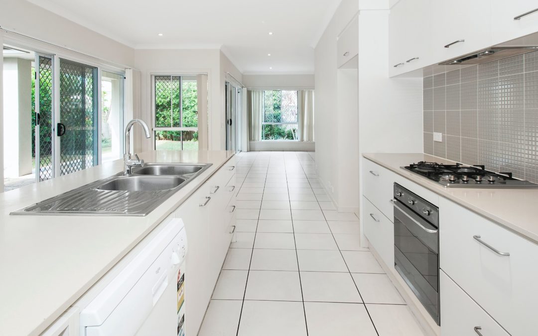
For a long time white has been viewed mostly as a background colour. It’s a neutral backdrop that allows other colours to be highlighted. It’s regarded as clean and simple, and is a staple colour of minimalist and Hamptons design. In terms of meaning,...
by Property Reimagined | Jun 26, 2021 | Colour That Pops
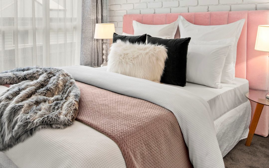
Ah, pink. As soon as you mention pink, people think of women. Which is interesting, considering it’s not that long since pink was the colour of choice for clothing small boys, as it was considered the precursor to strong reds, which men wore. It’s only...
by Property Reimagined | May 8, 2021 | Colour That Pops
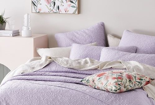
Purple is an underused colour when it comes to interior design, which is a shame. It encompasses everything from deep aubergine through to the softest of lavenders, making it extremely versatile in terms of the mood you want to create. Historically, purple was the...