by Property Reimagined | Apr 3, 2021 | Colour That Pops
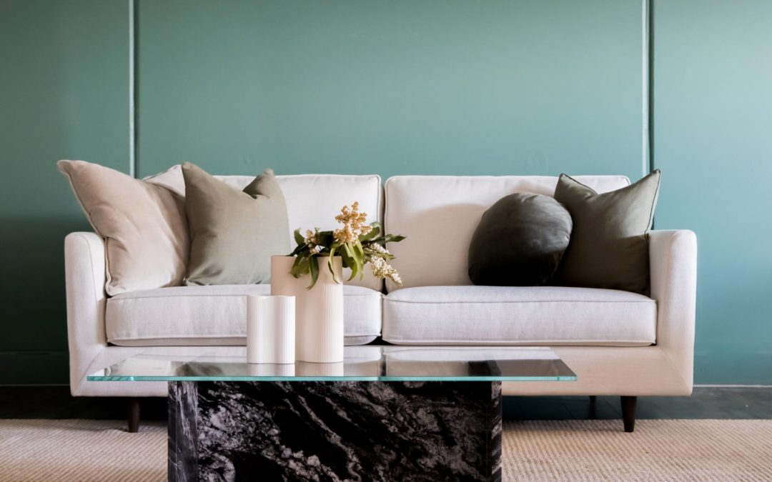
Green is a colour that goes in and out of fashion regularly for interior design. Particular shades are very reminscent of certain eras; who can forget the stunning lime green so popular in the 1970s, for example? As a colour, being a combination of the primary colours...

by Property Reimagined | Mar 7, 2021 | Colour That Pops
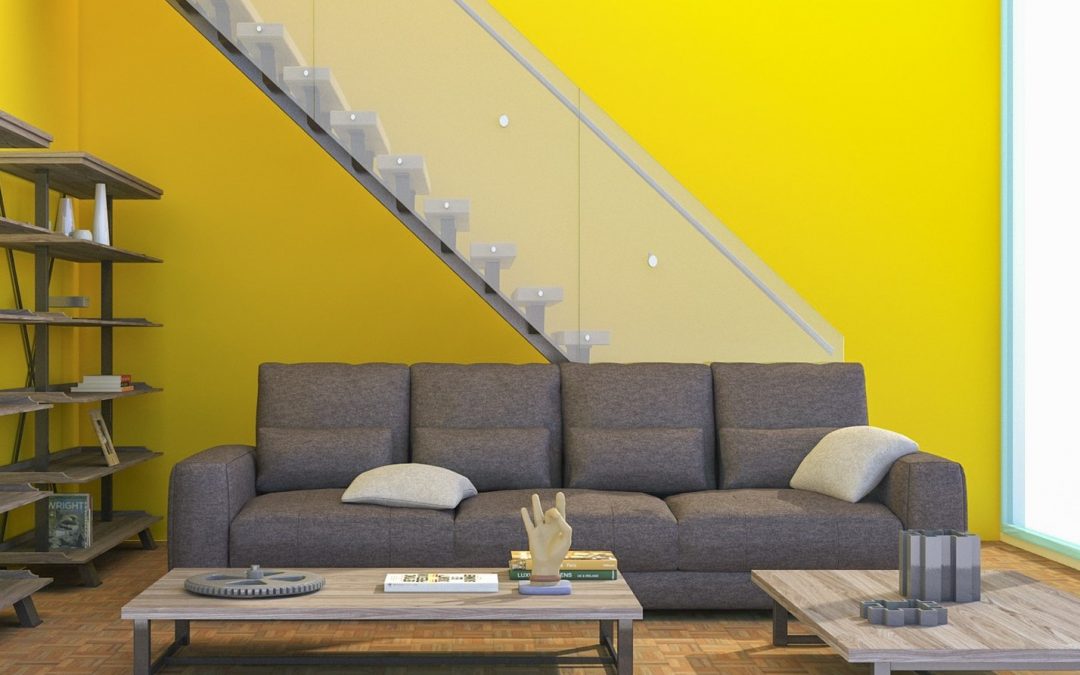
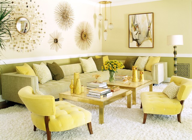
Ask someone what emotion the colour yellow represents, and almost invariably the answer comes back as “happines” or something similar. Yellow has long been associated with feelings of sunshine, positivity and cheerfulness. It evokes childhood memories of...

by Property Reimagined | Jan 30, 2021 | Colour That Pops
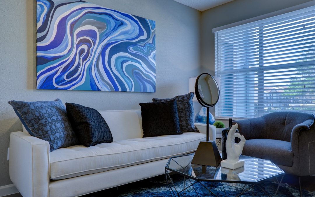
Blue is a very popular choice in interior design, particularly in the current trend for Hamptons style which is almost exclusively white and blue. This is hardly surprising, given that blue is a cool colour known for its calming and relaxing effect. It’s often...

by Property Reimagined | Dec 27, 2020 | Colour That Pops
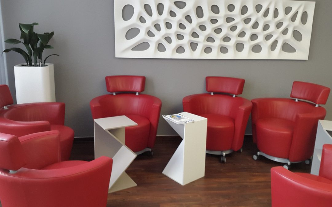
When it comes to interior design, colour use is incredibly important – but also very subjective. A colour that evokes a positive response in one person, may create a completely opposite response in another. However, despite individual differences, knowing what...

by Property Reimagined | Dec 6, 2020 | Colour That Pops
Recently we looked at using complementary colours when putting together the look of your home. This time we’re taking a look at analogous colour schemes. Analogous (even harder to say than it is to type!) colours sit next to each other on the colour wheel. As an...

by Property Reimagined | Oct 30, 2020 | Colour That Pops
If you’re ready to redesign your space, then it’s time to start scheming – the colour scheme kind of scheming, not the mwahahaha! evil villain kind. When it comes to choosing a colour scheme, one of the simplest is to use complementary colours from...
