Ah, pink. As soon as you mention pink, people think of women. Which is interesting, considering it’s not that long since pink was the colour of choice for clothing small boys, as it was considered the precursor to strong reds, which men wore. It’s only gained its current associations since around the 1950s. And of course marketers have jumped on the trend with glee, believing that if they make a pink version of their product they can specifically appeal to women.
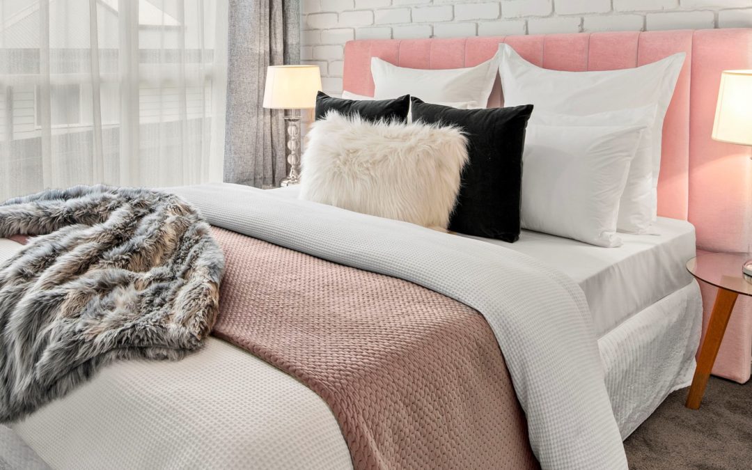
But on to using pink as a colour in interior design! One of the best things about using pink is the huge range of pinks that exist. There’s the lightest pinks, which give a feeling of softness, innocence and tranquility. Or you can go for the darker, bolder end of the pinks, with magenta or fuchsia, which give a strong, energetic vibe to a space.

Pink is a great choice as a background “neutral” colour, as it gives a room warmth, and flatters the skin tone. Used in this way it can be a more welcoming alternative to beige or grey, and works well when tied in to pops of colour in artwork or cushions. To achieve this, tint a less saturated hue of pink with white.
The wide range of pinks makes it easy to layer your room with different textures and shapes, so that you achieve a warming effect without feeling overwhelmed by the colour itself. It can be a fun and slightly unconventional choice for a highlight colour in a rug or curtains.

Remember – avoid going over the top with florals or ruffles, as you can tip a room over into a feminine cliche. Stick with clean, structured lines to enjoy the colour without making any man run a mile as soon as they walk into the room.