As the last of the fireworks fade out of the sky and the champagne bottles are dumped in the recycling bin, it’s time to think about colour trends for the new year.
There have been lots of announcements in the past month. Probably the most eagerly awaited one was from Pantone, long considered at the forefront of colour trends.
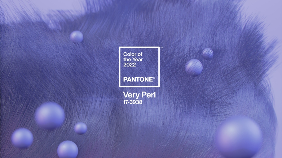
And their verdict? They created a new colour called “Very Peri”. It’s a periwinkle blue, with a red violet undertone.
Apparently they wanted to come up with something that “symbolised the global zeitgeist and the transition the world is going through”. All that from one colour? Wow. Not asking much!
To create a colour that was familiar, felt safe and comfortable, and was beloved by many, they started with blue. The red violet undertones are a reflection of the digital world, while relaying a sense of freshness and movement towards the future.

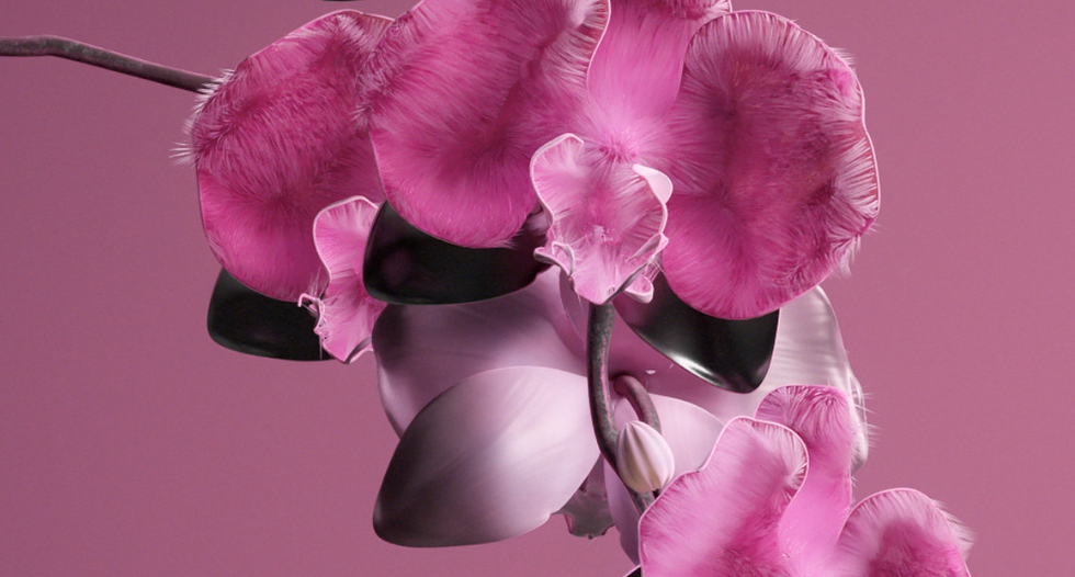
A couple of other notable colour trends come from WGSN, a trend forecasting company, which went with Orchid Flower. This is a saturated magenta colour, reflecting a sense of positivity and escapism.
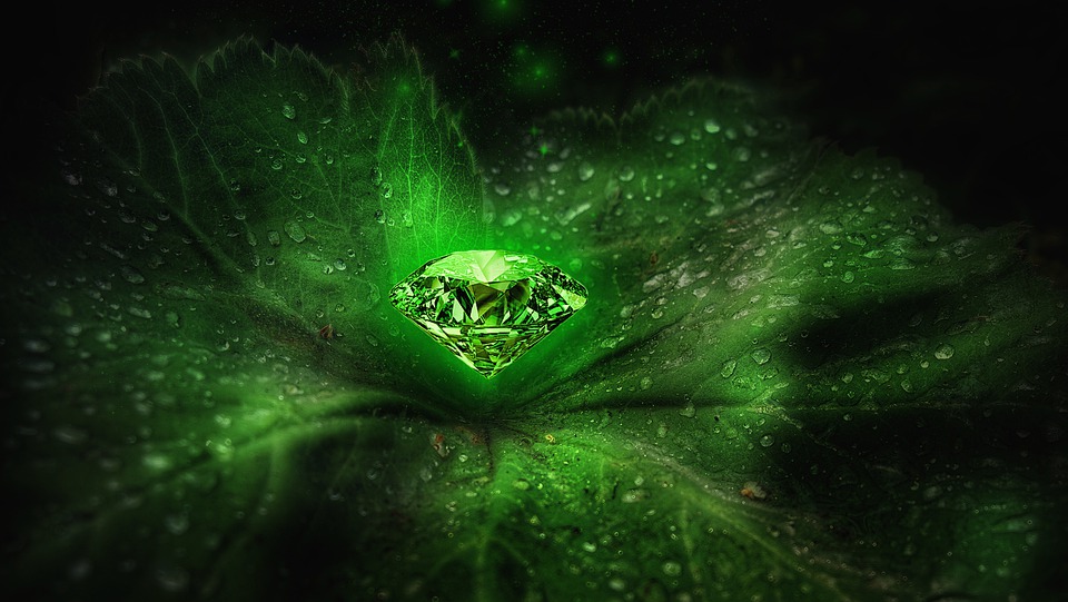
And finally, Etsy chose Emerald Green, for its reflection of harmony, royalty, growth and refinement.

These colours have already started to appear on red carpets around the world, so it will be interesting to see how long it takes before they move into interior design. Emerald green certainly raised its head in 2021, so that’s a trend that’s already well underway.

