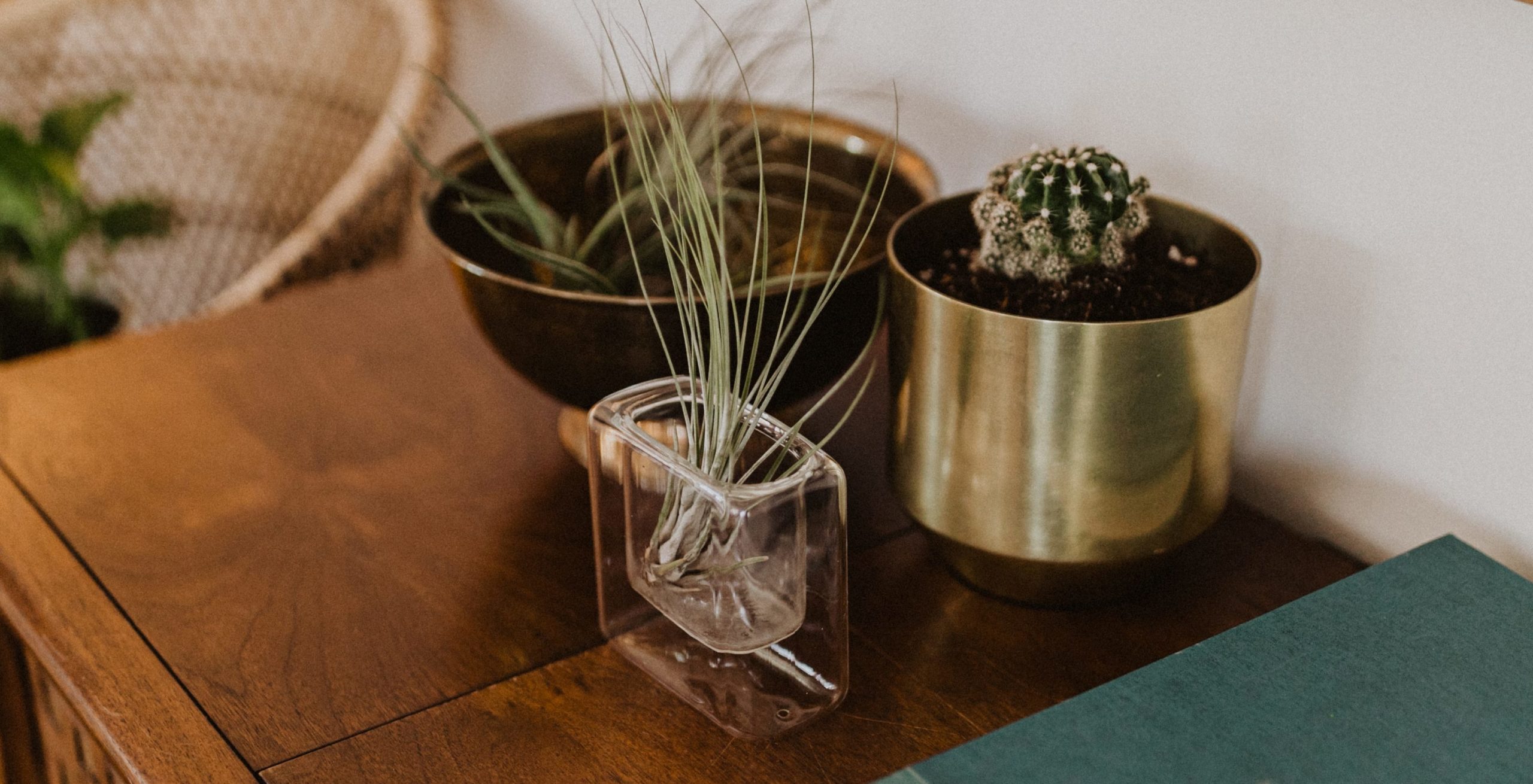
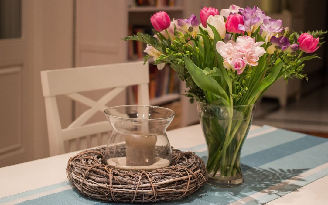
An asymmetrical vignette allows for a creative and visually appealing arrangement that breaks away from traditional symmetrical layouts. To create an asymmetrical vignette, follow these steps:
Choose a Focal Point: Start by selecting a central focal point for your vignette. This could be a decorative object, artwork, a vase of flowers, or any item that you want to draw attention to. The focal point will serve as the anchor for your asymmetrical arrangement.
Create Visual Balance: Although the vignette is asymmetrical, it should still maintain a sense of visual balance to avoid looking chaotic. To achieve this, consider the visual weight of each element you add. Visual weight is determined by an object’s size, color, texture, and placement. Balance heavier or visually dominant items with lighter or less visually striking pieces.
Vary Heights: Asymmetry often involves playing with different heights to create an organic and dynamic composition. Use items of varying heights, such as tall vases, medium-sized sculptures, and smaller decorative pieces. This diversity adds interest to the vignette and draws the eye around the arrangement.
Mix Shapes and Textures: Introduce a mix of shapes and textures to add depth and dimension to the vignette. Combine smooth, sleek objects with rough, textured elements. Contrasting shapes and textures will contribute to the overall asymmetrical aesthetic.

Consider Negative Space: Negative space, or empty space, is just as important as the objects themselves. Allow some areas around the focal point to remain open, creating breathing room for the eye. This negative space enhances the overall composition and keeps the arrangement from feeling cluttered.
Remember, asymmetrical vignettes allow for creative expression and individuality. Embrace the uniqueness of each arrangement, and have fun exploring different combinations of objects to create a visually captivating display.


