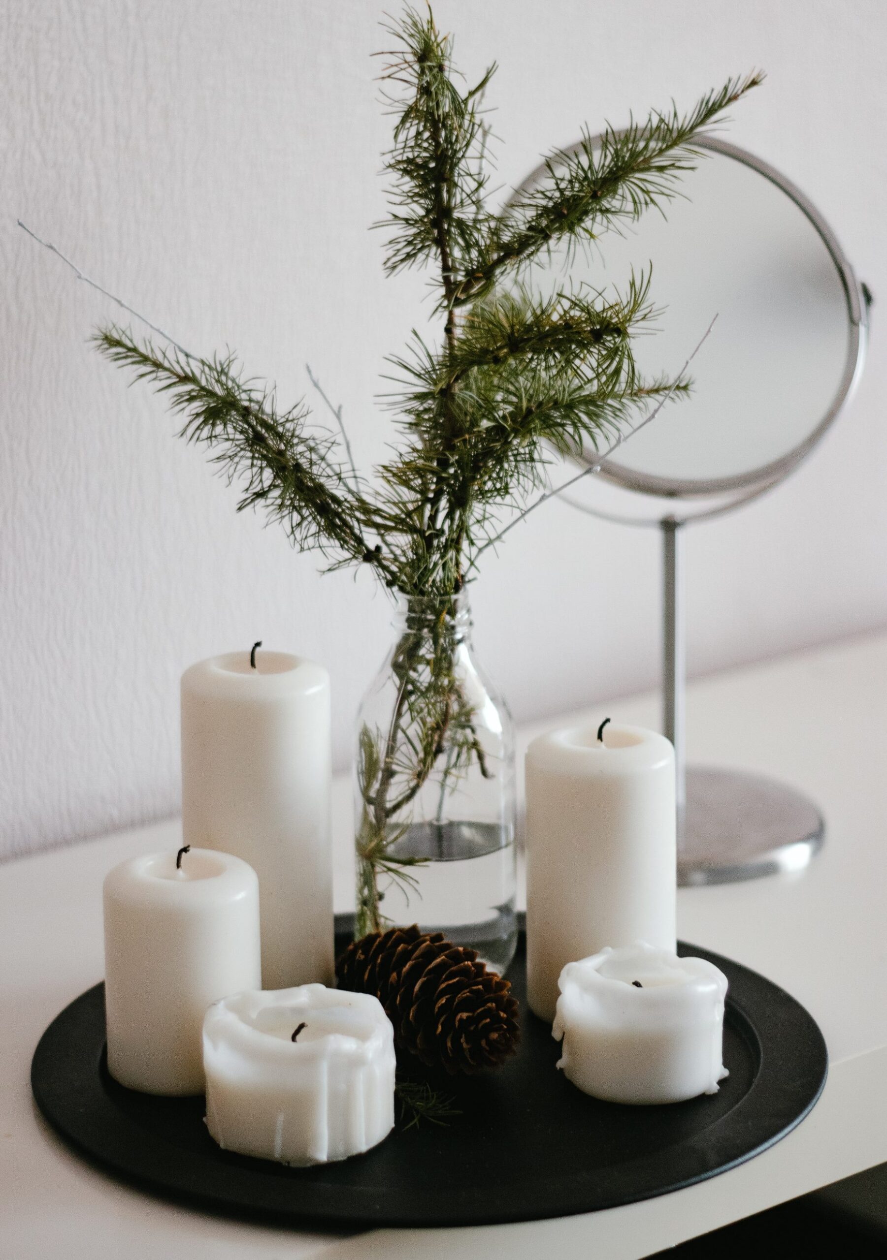
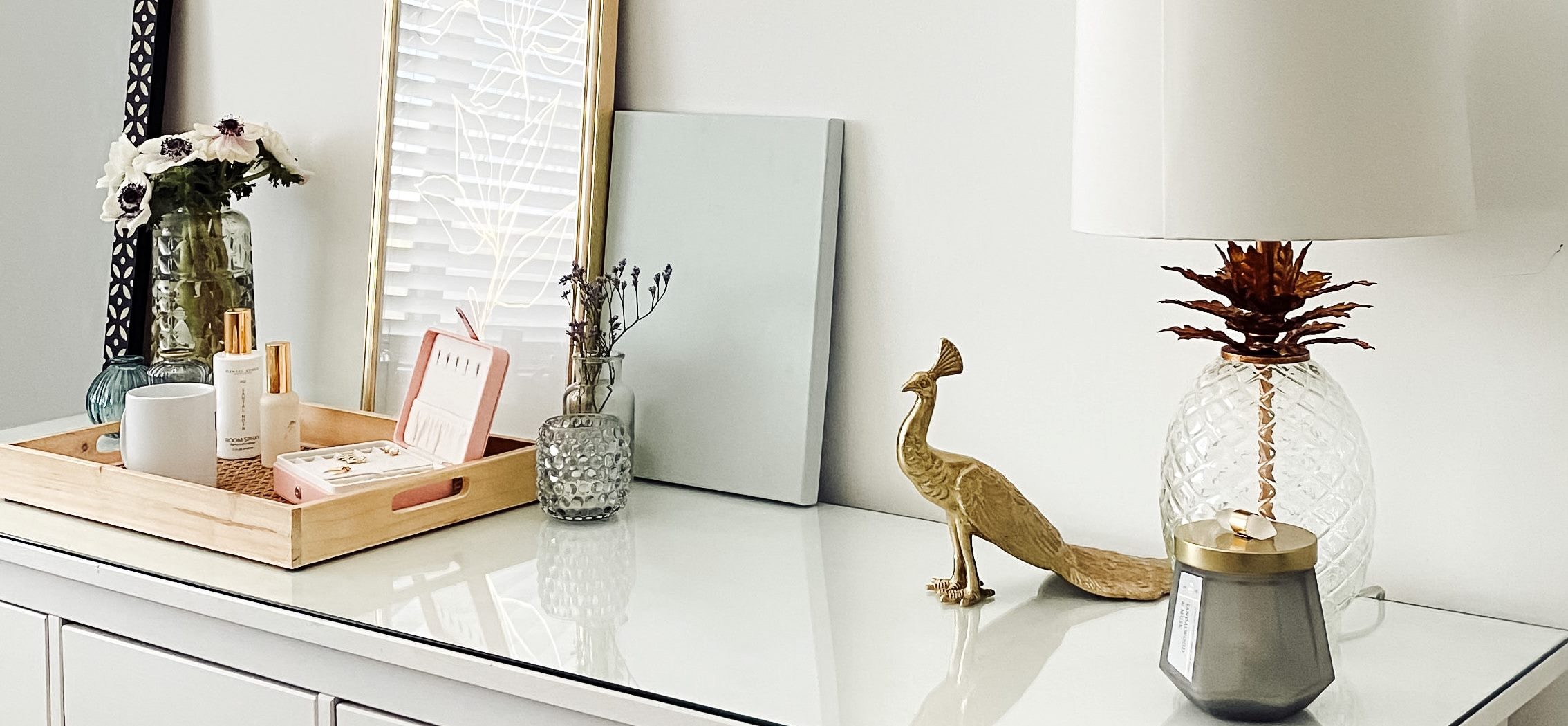
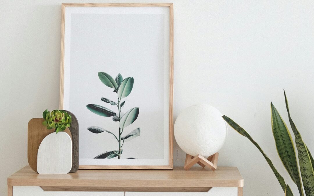
While some people prefer symmetry in design, sometimes having a mix of asymmetrical elements helps to create a vignette that’s more eye catching. Each piece needs to be looked at separately to appreciate it, rather than being overlooked as it’s simply a mirror image.
So here are some more ways to achieve asymmetry in your vignette:
Flow: Arrange the elements in a way that creates a sense of movement or flow. The eye should be guided from the focal point to the surrounding objects in a smooth and intuitive manner.
Odd Numbers: When placing multiple items in the vignette, use odd numbers (3, 5, 7, etc.). It’s much easier to create a natural asymmetrical look as the brain can’t automatically create pairs.
Experiment and Adjust: Asymmetrical design allows for a lot of experimentation. Don’t be afraid to move objects around, swap items, or try different combinations until you achieve a composition that feels balanced and visually engaging.

The important thing here is to express your creativity in an individual way. Have fun!


