There are plenty of people who will tell you styling isn’t their thing. And I get it. Most of us chuck a few cushions on the couch and that’s about as styled as our living spaces ever get.
So the thought of using vignettes to add style to surfaces in the house can feel overwhelming. But it doesn’t need to be that hard if you think of the letter A.
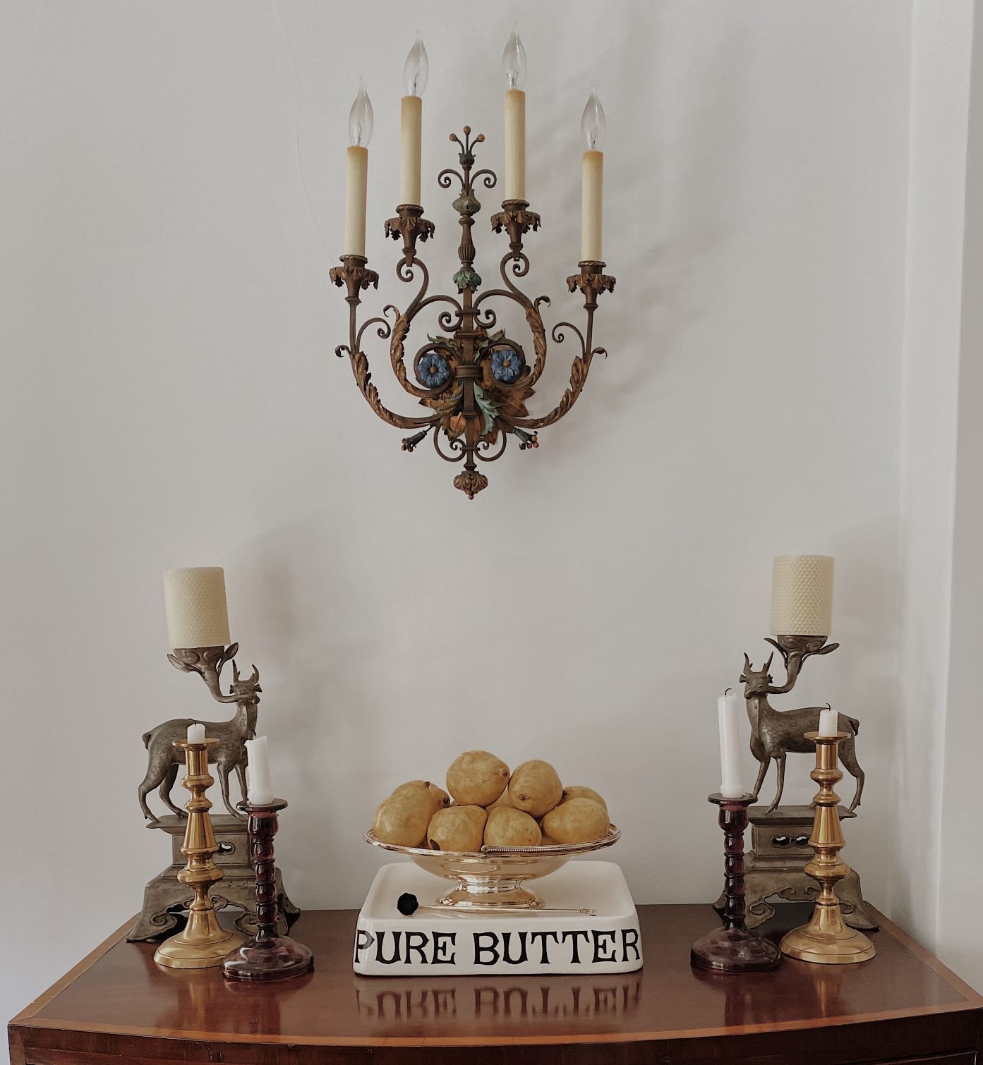
I’ve often mentioned in these blog posts that it’s considered optimal to have an odd number of items in a vignette. And when you think about the letter A, you realise it has 3 main points – two at the bottom and one at the top. Those points form a triangle.


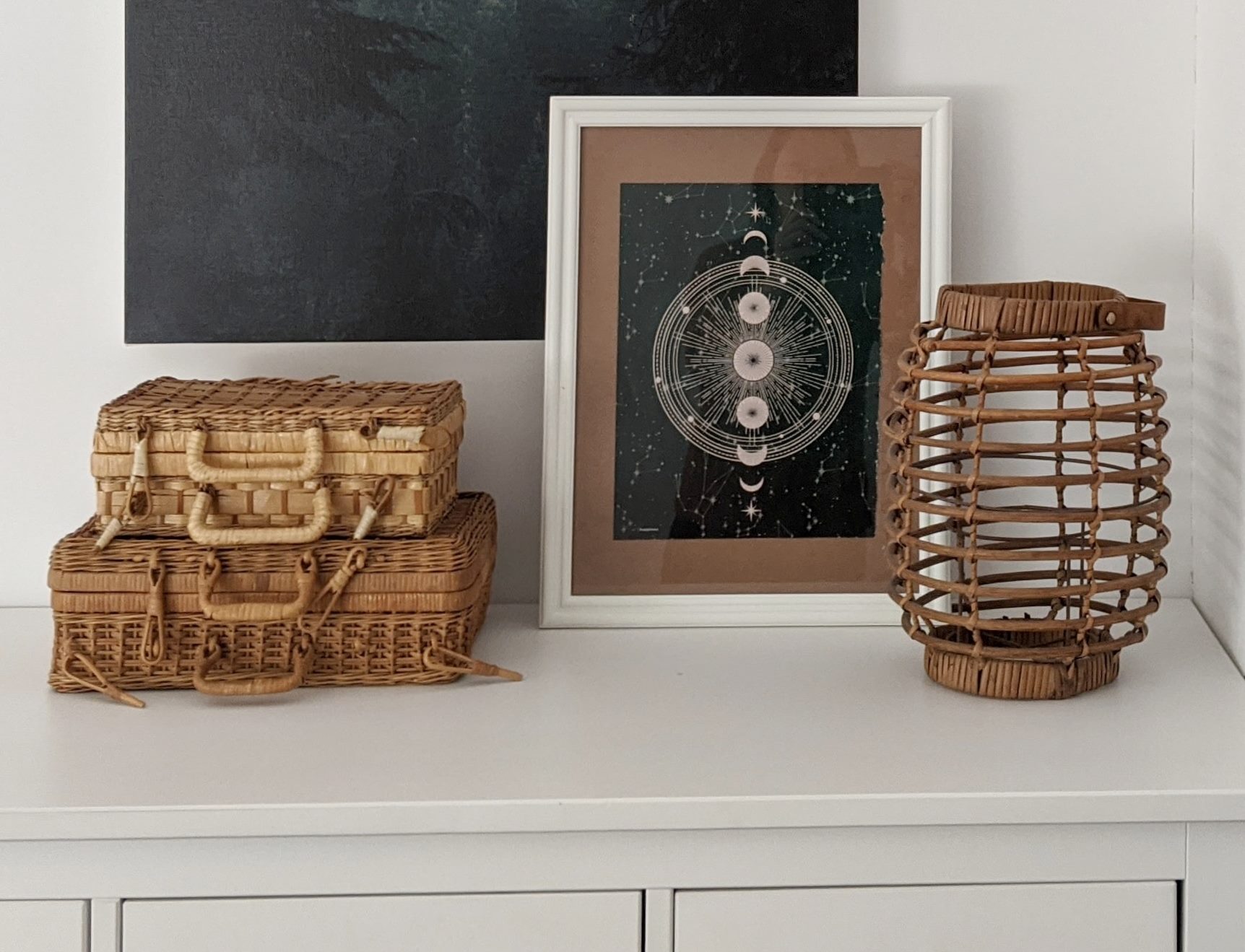
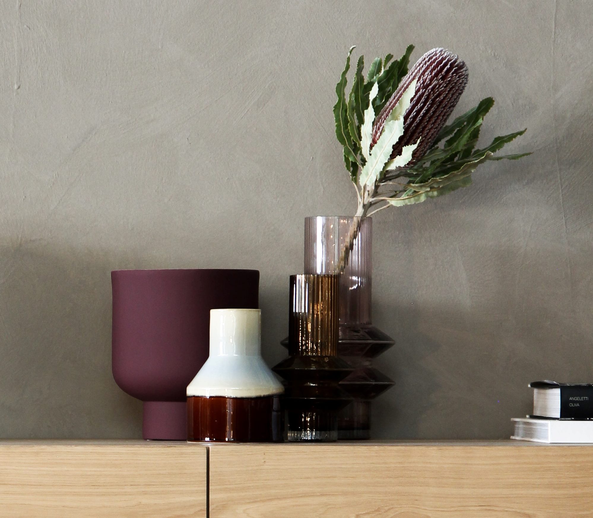
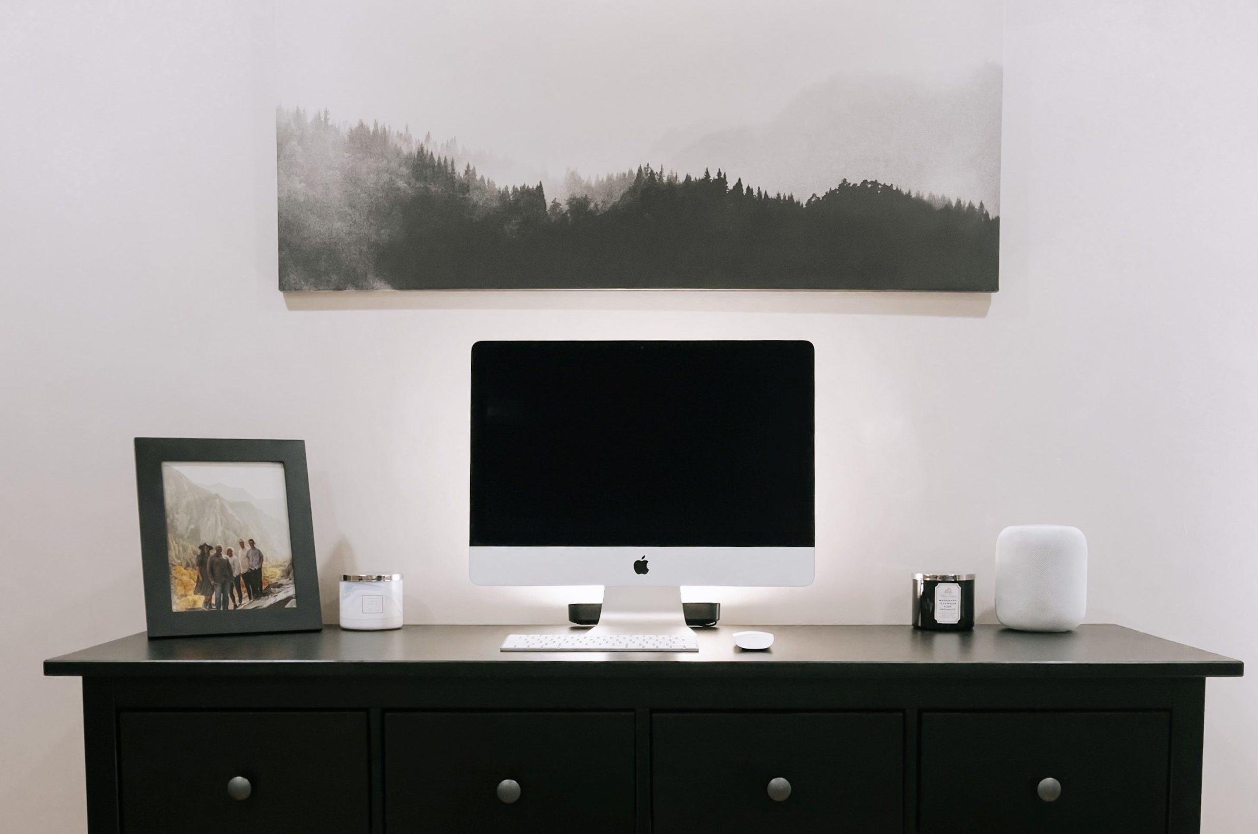
What you need to do is remember that basic shape when you’re putting together items to form a vignette. Tallest one in the middle, smaller ones on either side. And there you have it – a vignette!
Once you understand the “A” concept, or the upside down V, as it’s sometimes called, styling vignettes is simple. As you gain confidence, you can then start to play with the shape. For starters, you can turn the A upside down.

Another way is expand outwards from the A. Add some flowers for height, or put a couple of items together to form one of the points of the A.
Flatten the A out if you have a wide surface, or stretch it up if your space is tall and narrow.
You’re only limited by your imagination – and we all know that’s not limited at all.

