If you’re interested in design, and particularly if you are thinking about updating your own home, either in terms of paint or styling, then learning about the colour wheel is a great place to start.
Essentially, the colour wheel can be used to develop a whole range of different colour schemes, without you having to guess which colours will work well together to create an overall feel or style.

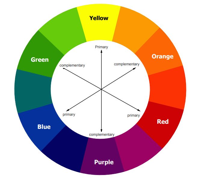
The basic colour wheel contains 12 colours, broken up into 3 groups.
Primary Colours
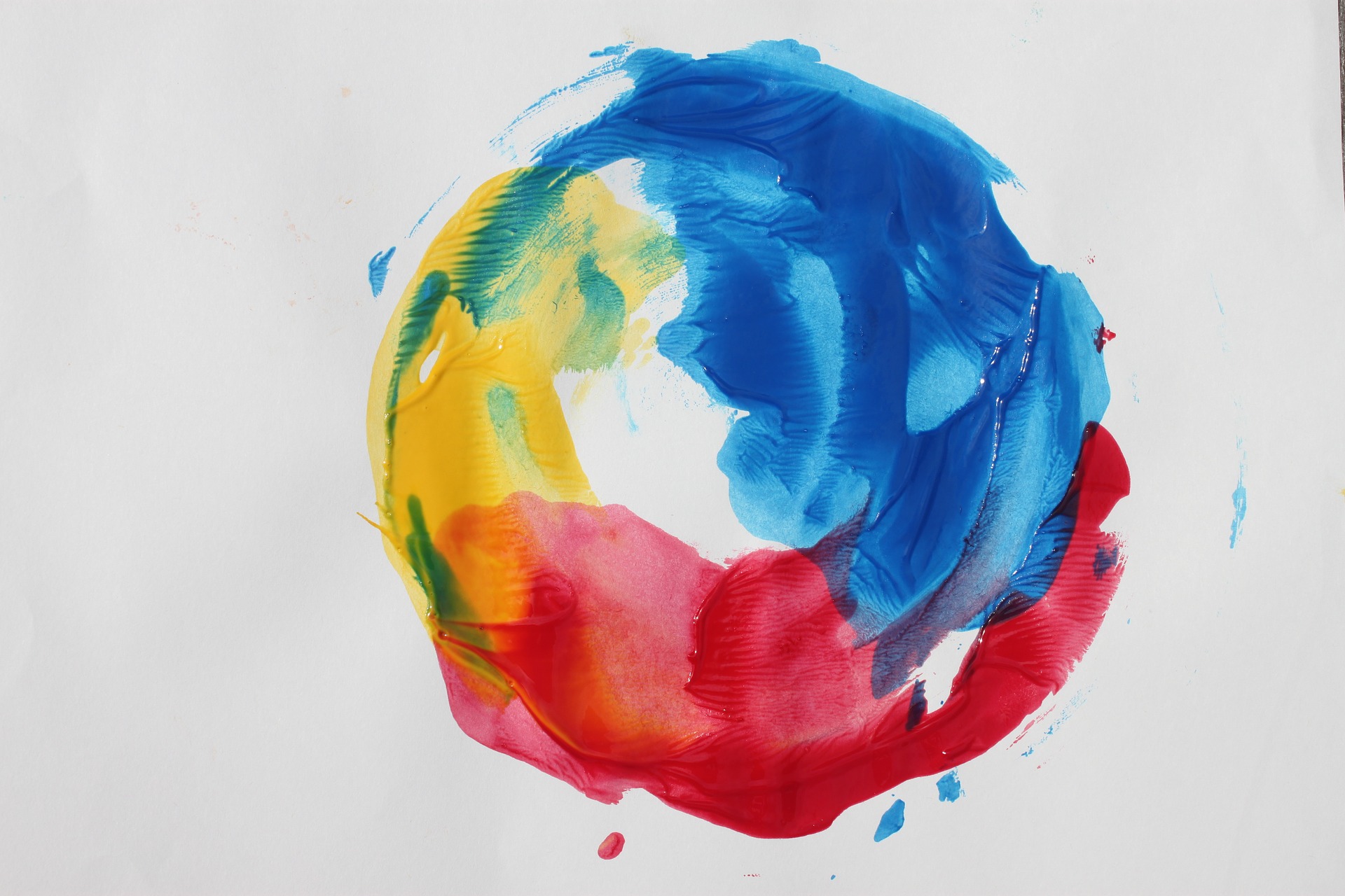
You probably learnt these on your first day in art at school. The primary colours are red, yellow, and blue. They form the basis of most other colours of the rainbow.

Secondary Colours
When you mix the primary colours together, you get the 3 secondary colours – green orange and purple.
Tertiary Colours
Finally, there’s the 6 tertiary colours. Have you guessed the pattern yet? That’s right – tertiary colours are formed by mixing primary and secondary colours to get a range of greens, blues, oranges and purples.

The Temperature of Colours
If you draw a line through the centre of the colour wheel, you can split it into warm colours (reds, oranges, yellows) and cool colours (greens, blues, purples).
From a design perspective, knowing that colours have a “temperature” is important, as it influences how your room makes people feel. Warm colours are associated with brightness, energy and action, whereas cool colours are considerate calming, peaceful and serene.
There’s a lot more to learn about colour, which we’ll cover in later blog posts. But if you’re unsure where to start, choosing one of the 12 colours from the colour wheel is a good place to start. Choose your favourite and then narrow down your choices until you find the exact shade you love.

