One of the best (and scariest!) parts of renovating is choosing colours. In an earlier blog we introduced the colour wheel and how to use that to help in your search for colours.
There’s a lot more to colour choice, however, than primary, secondary and tertiary colours. Welcome to the exciting world of tints, shades and tones! If you’ve ever heard someone list off dozens of different names for the colour you naively called “cream”, then you’ll know what I mean. Ecru, ivory, seashell, old lace, beige, parchment, antique white, champagne… I’m sure you’re getting the idea.
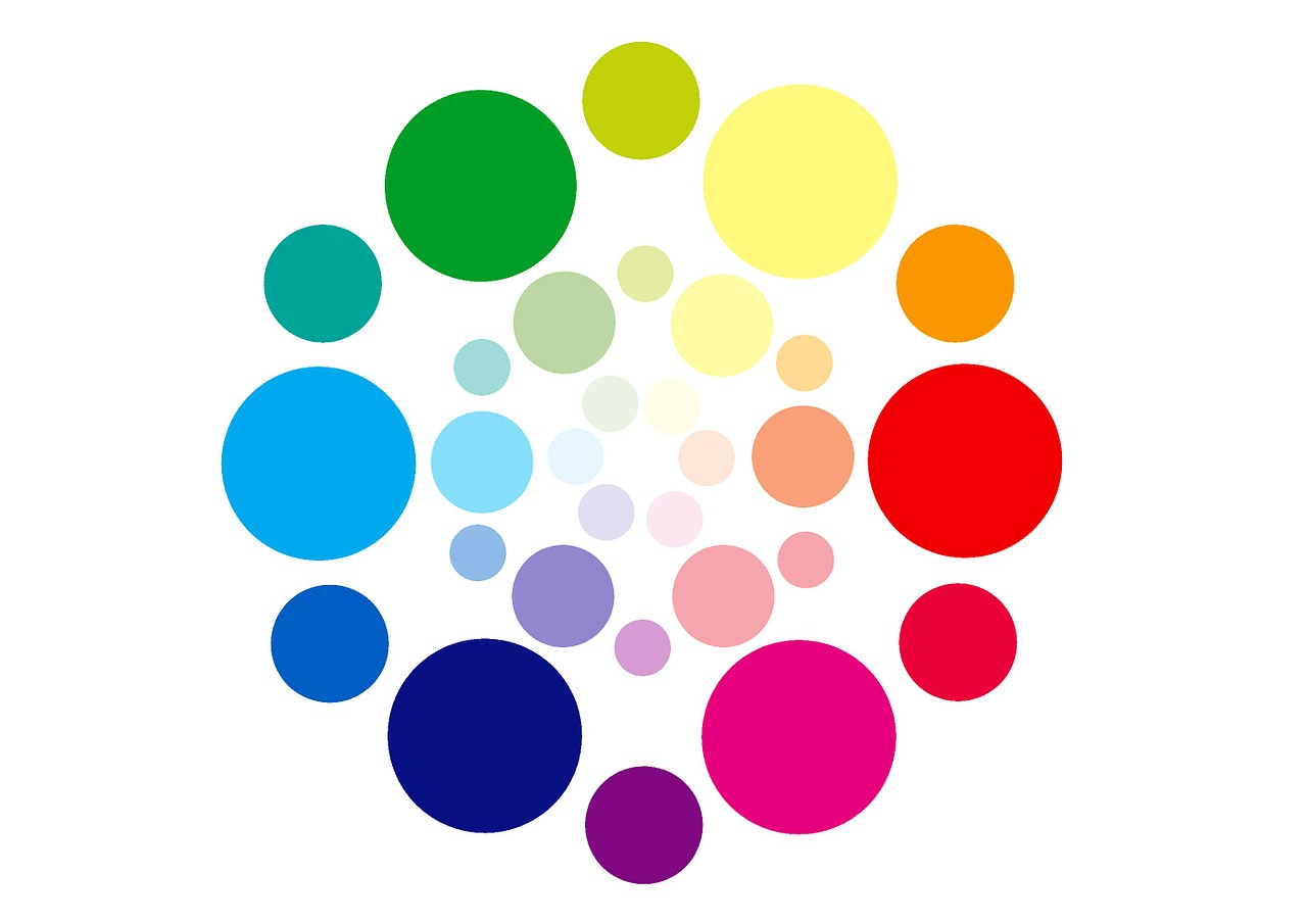
Essentially, once you’ve selected a basic colour, it’s time to create different versions of it. And that’s achieved by adding the neutrals – black and white. One base colour can be expanded into a huge family of colours in this way.
There are 3 main terms to remember:
- Tint – add white to lighten a colour
- Shade – add black to darken a colour
- Tone – add grey to slightly darken a colour

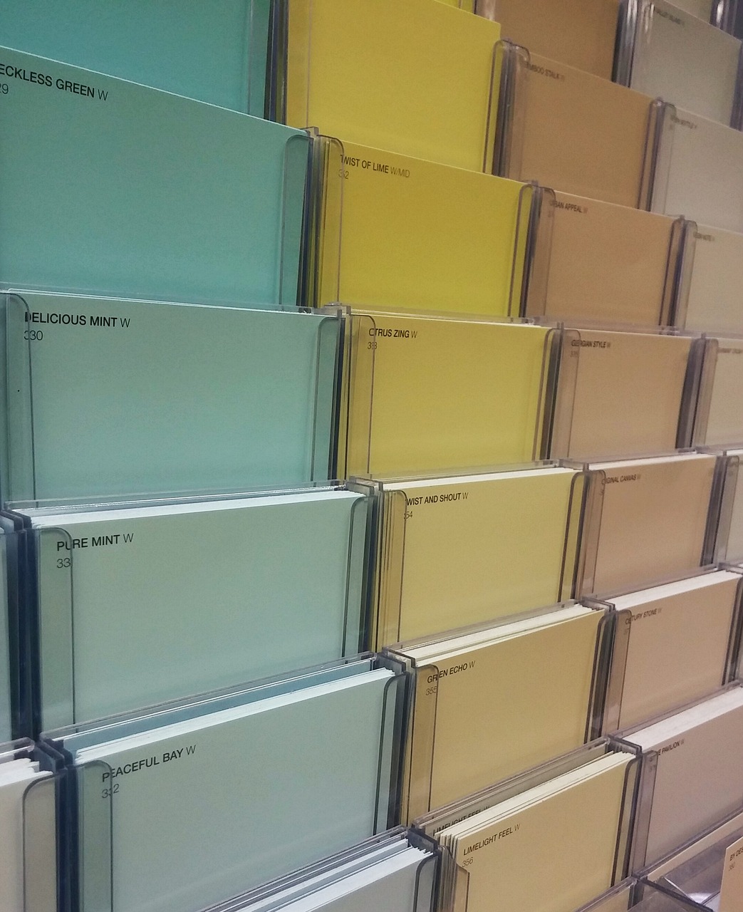
Okay, you’re done. Oh, you want more information? Well, a good place to start is to think about the sample colour strips and brochures you can get at your local paint store. They’re grouped to show a range of tints, shades and tones of the same colour.

Tints
To get a tint of a colour, you add the colour + white. A common example if red + white = pink. The tricky part is exactly how much white you add. If you only add a little white, then you get a shade of red that’s still quite close to the primary colour. If you add a lot of white, you’re going to be in the pale pink range.

Shades
For shades, you add the colour + black. Using red as the example again, add a little black and you get a red just a little darker than primary red. Add a lot of black, and you’re going to be in the burgundy end of the range.
Tones
I’m sure you can guess how this one works now – add the colour + grey. This one produces the widest range of results, as grey itself is a combination of black and white. So depending what shade of grey you use, there’s a massive number of possible variations, both lighter and darker than primary red.

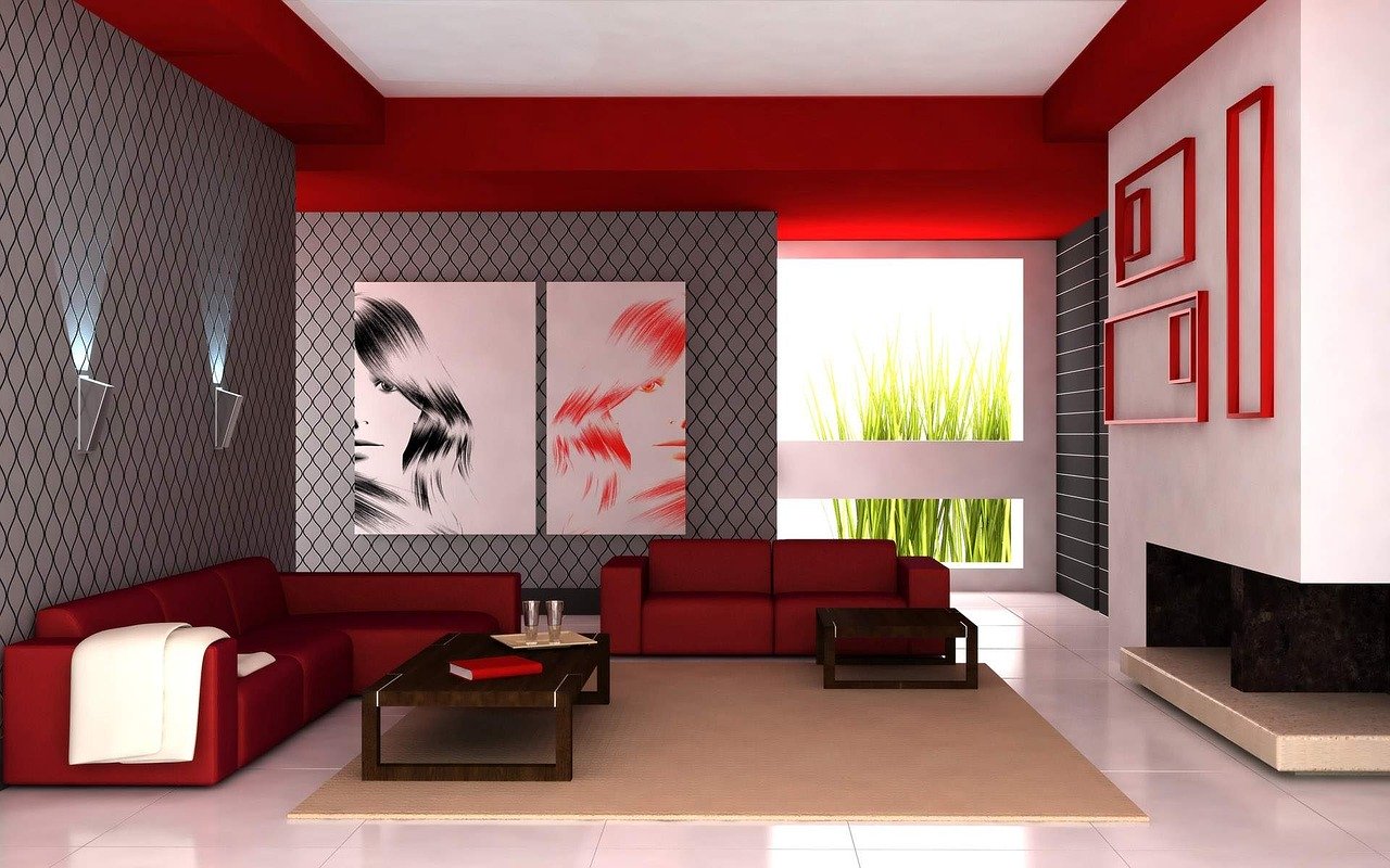
Colours go in and out of fashion in interior design, and the current trend for creating a modern, elegant interior is very much on the darker side of the spectrum. Colours such as dark grey, charcoal and chrome are offset with contrasting whites and light greys. But don’t allow yourself to be restricted by trends – use what you’ve learnt about the colour wheel and various tints, shades and tones, and add a pop of colour to give your interior decorating the “wow” factor!

