Although asking “What’s Behind It?” sounds very conspiratorial, thinking about the background for your vignette is actually an important part of the design process.
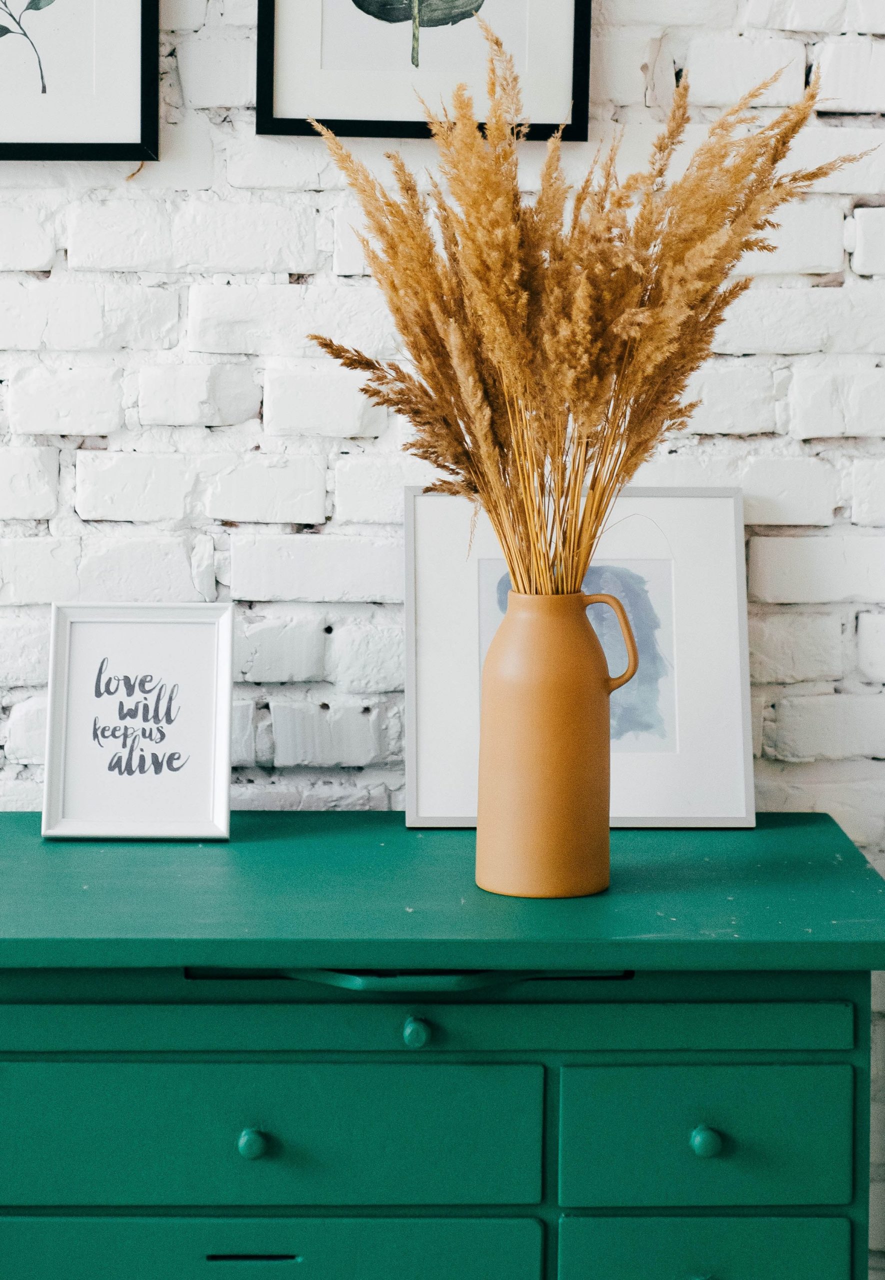
To get started, think about the look of the background. Is it a flat, single coloured wall? Or patterned wallpaper?
To avoid clashes, you should make sure a busy background has a simple vignette, and vice versa. In other words, don’t put highly patterned vignette objects in front of a busy background – use them in front a plain background to avoid visual chaos.
The same goes for colours. If the background is a colour that clashes with the vignette pieces, it will be out of harmony. Instead, find ways to pick out complementary colours in either the objects or background so they are harmonious.
An example of this might be where you have a large piece of artwork on the single-toned wall, and the vignette contains references to the colours in the art.
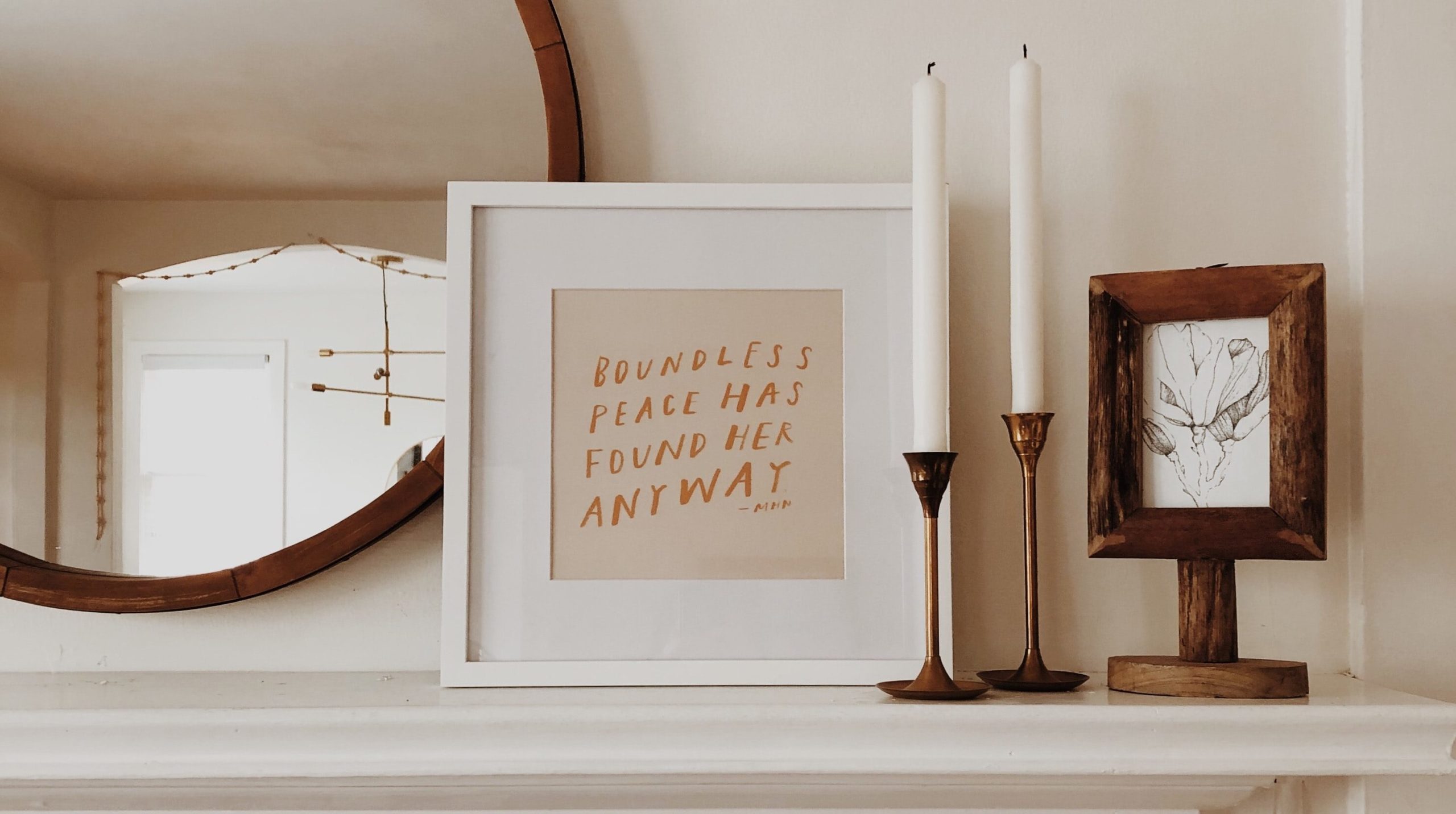
Mirrors are also popular on walls, and placing a vignette in front of one can give the vignette more animation, adding perspective and depth. It also multiplies the visual impact of the vignette.


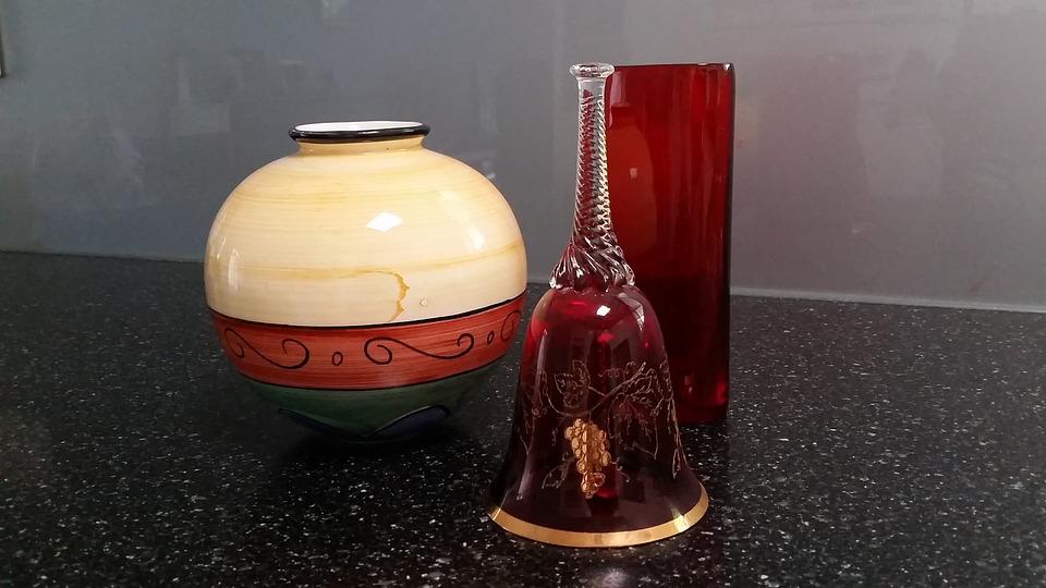
Remember, too, that if your vignette is placed on a surface that effectively becomes a background as well. So the earlier point about avoiding clashing patterns holds true. Keep your colours and shapes simple if they’re on a visually busy background.
Or, if you find that your vignette objects are clashing with the surface, then consider using a simple tray or basket to intercede between the two elements.
Designing your vignette to complement and enhance your background is a great way to give added impact to the objects you choose.

