You’ve collected your objects. You have a place to put them. And now comes the fun part – how do you group them in a way that is aesthetically pleasing to the eye of the beholder?
Now it’s time to bring your ‘A’ game – or more specifically, think about the shape of the letter A.
In fact, stretch your mind a little further, and recognise that the letter A is essentially a triangle with one point at the top.
What you’re trying to achieve with your vignette is to replicate that pointy shape. The idea is to carry interest around the frame, so that all the items are viewed.
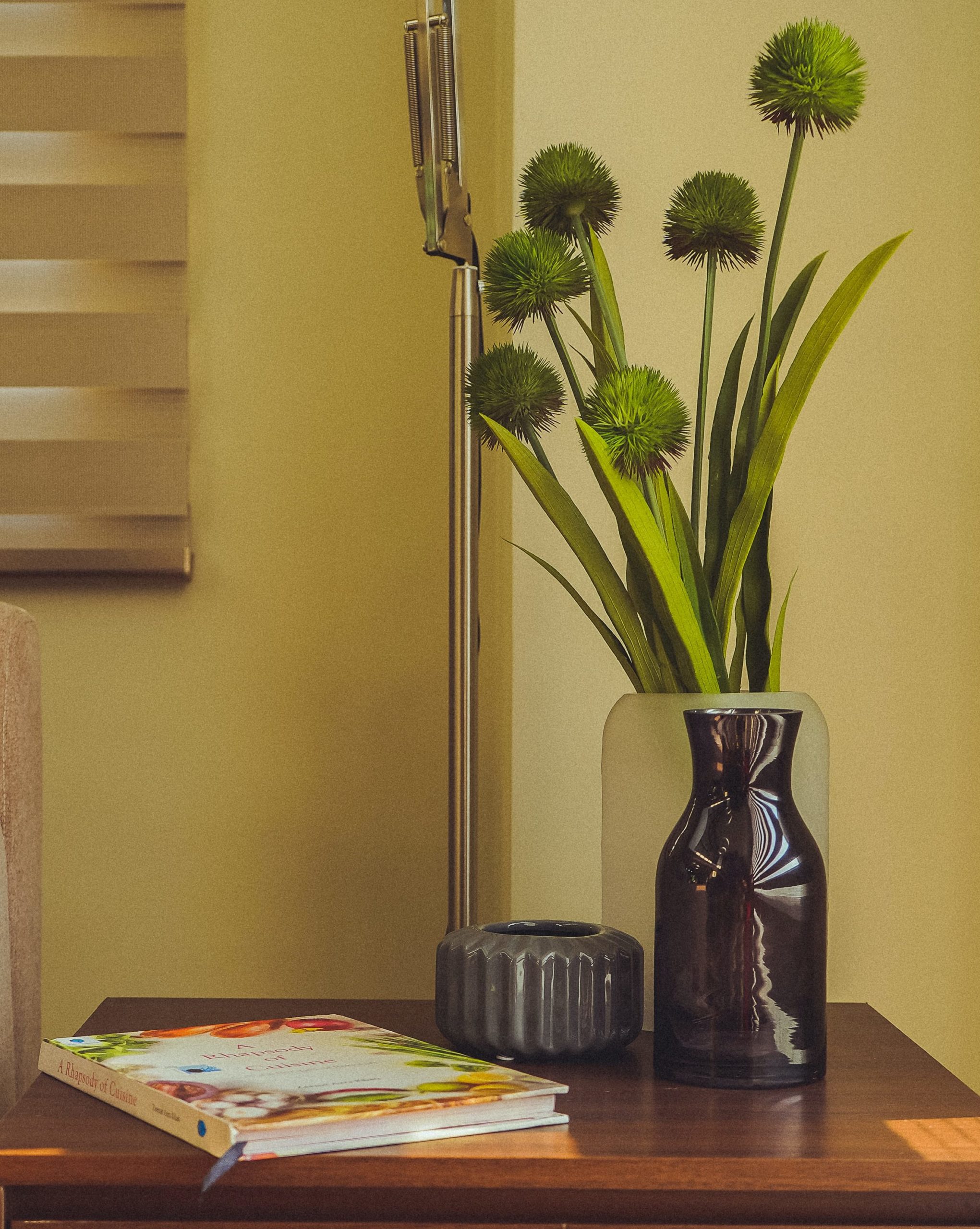
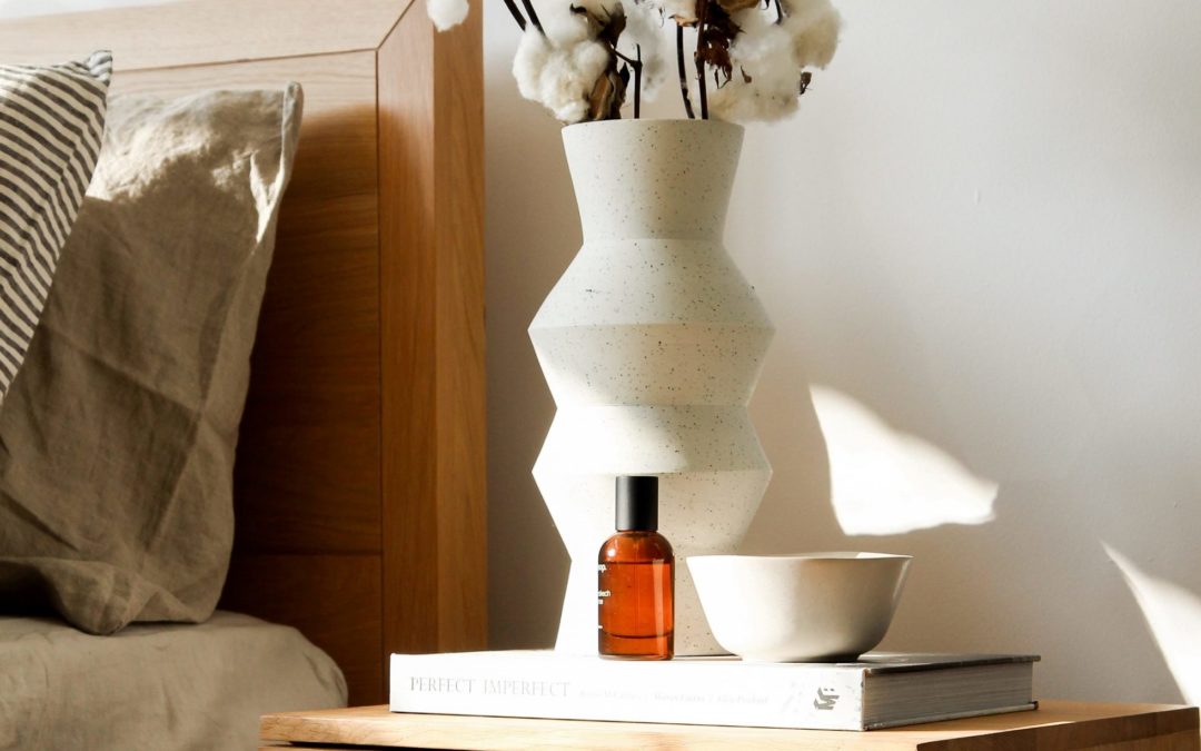
It’s easiest to start with your tallest item, and put it in the middle. It forms the top of your ‘A’ or triangle. Then group your other items is descending heights to form the sides of the triangle, ending up with the smallest at the front.

If you have a couple of items of the same height, then it can be helpful to place one on a small pedestal, such as another item or a couple of books, to achieve a variation in height.

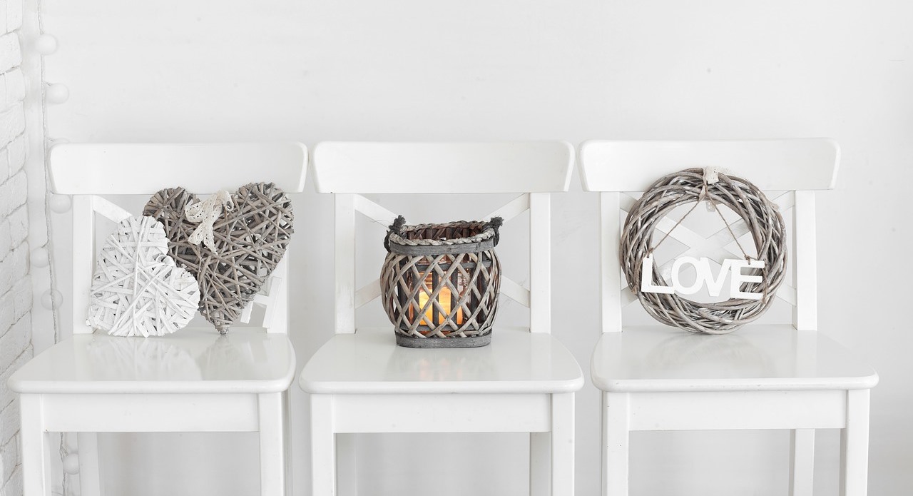
Find yourself in a situation where you have a group of similarly-sized items? Linear arrangements can work well if there is a strong connection between both the items and a contrast. In the photo above, the vignette items contrast well with the identical, stark white chairs.

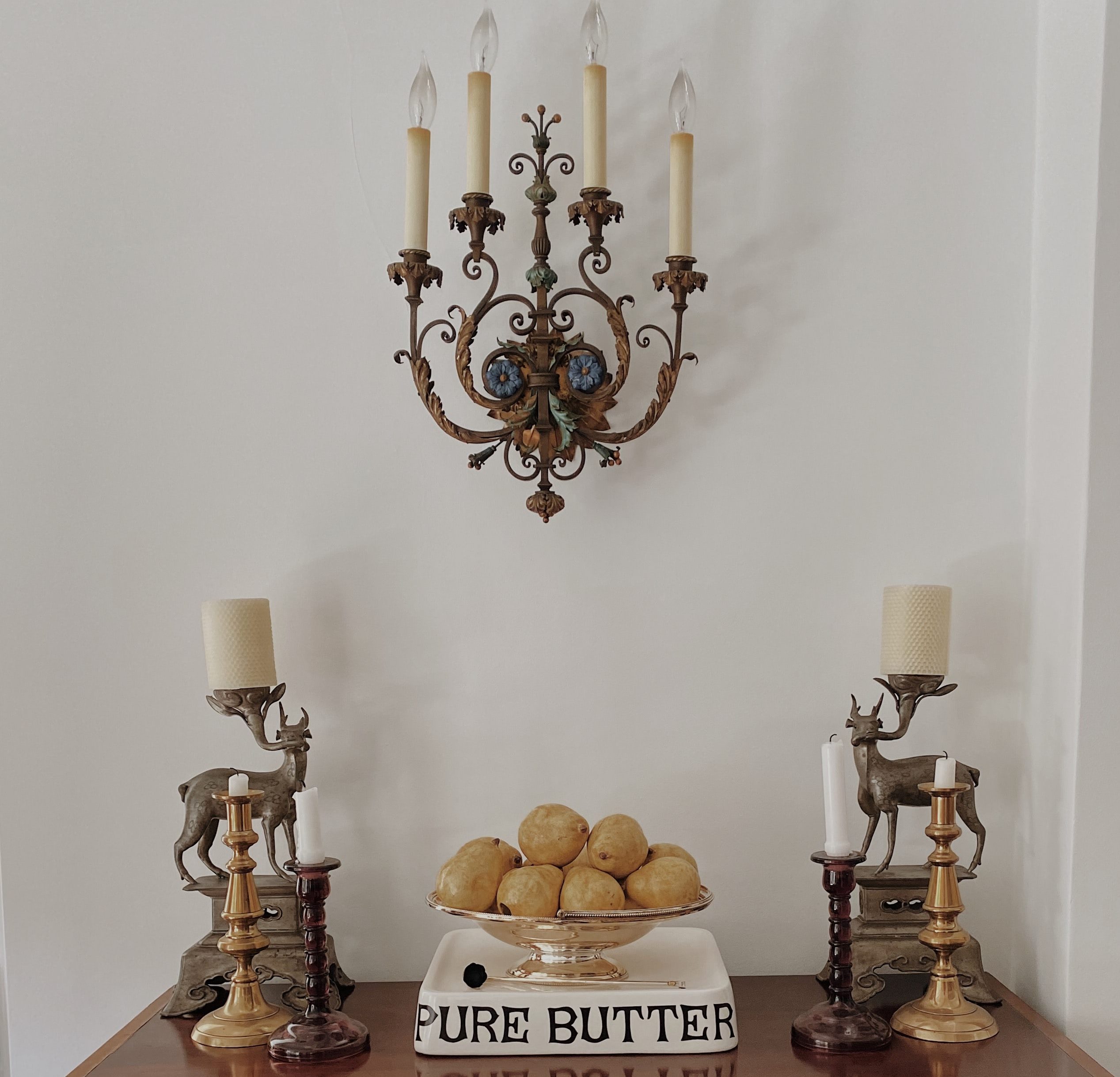
Another trick you can use if you have pairs of items (and you like symmetry!), is to arrange them so that an item on the wall behind, such as a mirror or lighting fixture, forms the top point of the triangle.
Bring your ‘A’ game to your vignettes, and you’ll find it much easier to turn your fascinating bits and pieces into visually pleasing displays.

