I’ve often talked about grouping items with a common theme, or the same item in different sizes etc.
Sometimes, though, you want a little more variety in your items. It’s a fine art to take a group of contrasting items and make them work in a space. So let’s take a look at a great case study.
Sometimes, the simplest way to tie a group of objects together is the use of colour. You can either choose a common colour theme for the group, or, even better, tie that colour in with other colours in the space.
The best part about this approach is that you can take a very neutral room and give it a whole new lease of life through the colours you choose for vignettes, furnishings, art and more.

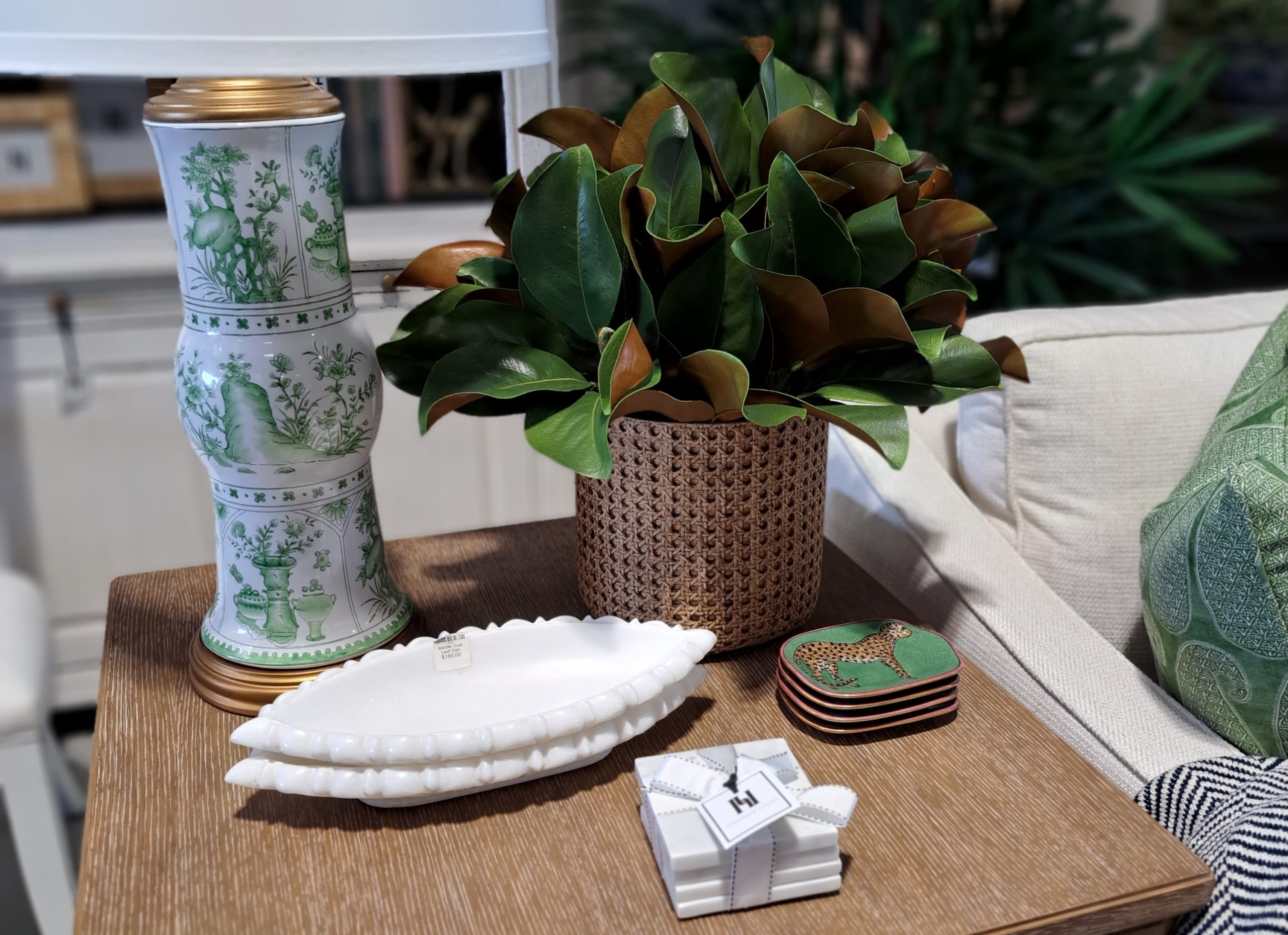
Here’s a great example. This vignette on a coffee table has a keynote of green, blended with white and rattan brown. Note how the cushion on the sofa right next to it has a green pattern.

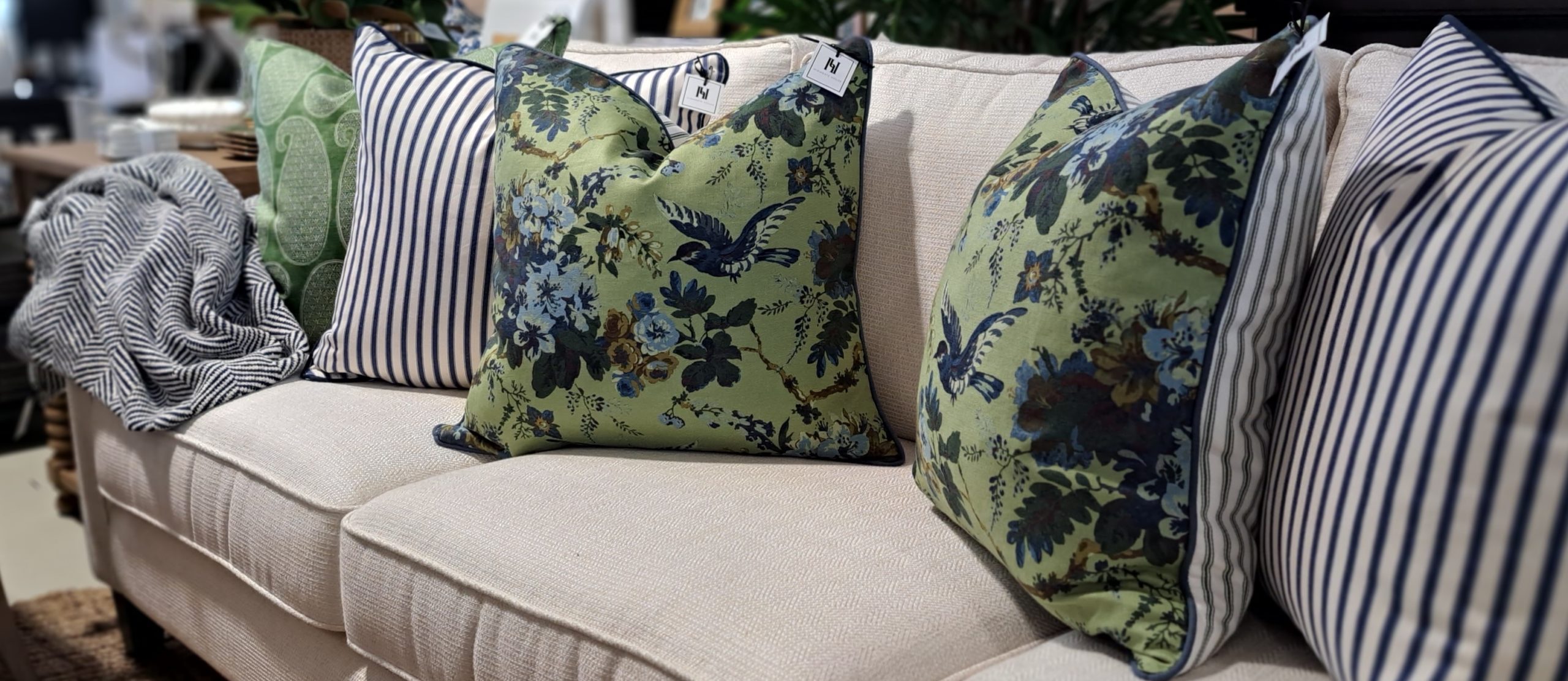
Now we move out to a broader look at the sofa, and can see the cushions are styled very cleverly. The first and third continue the green theme, despite having vastly different prints, and the cushion in the middle ties in to the stripe on the back of the floral cushion. Even the throw has a soft green weave!

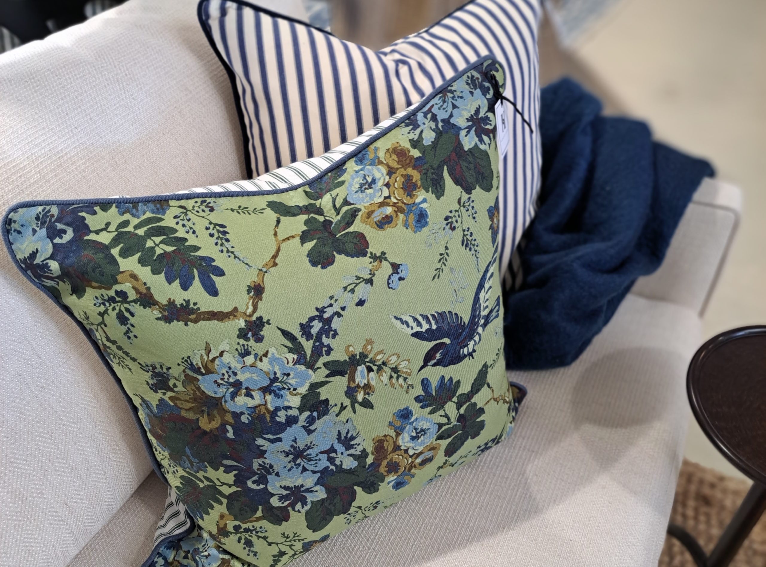
Finally, the other end of the sofa. Cushions are repeated to tie everything together, but this time the green patterned cushion has gone and replaced with a blue throw.
There’s an old saying “blue and green should never be seen”, but this is a brilliant example of using a blend of contrasts with a strong base note to product a cohesive overall style.
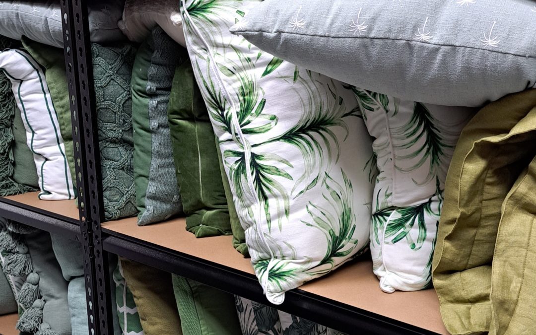
My thanks to Highgate House in Albion Qld, for hosting our recent visit. Their team really knows how to style! Thanks also to Foxy Home Staging – that’s their rack of green cushions in the main photo. Absolute heaven for me, so many green cushions!!

